A site that you can edit and expand
A site that fits in all devices and platforms
Fast loading & fast retrieval web development
A site that responds in all devices
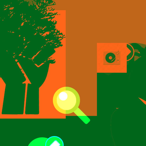
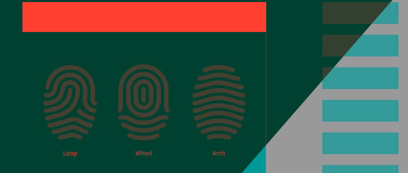
Mobile user experience design is maturing. One way to gauge this is to look at the tools at your disposal. Prototyping tools such as Balsamiq, Axure and Fireworks enable us to build wireframes and click-dummies, helping us to explain the targeted user experience.
Dragonroll lets you wrap your core marketing message into a compact and compelling website. How robust is your user experience design process? We all have our favored methods and techniques, but the general process is similar: Conduct research, prototype, then present to stakeholders and users.
Flat design refers to a style of interface design which removes any stylistic choices that give the illusion of three-dimensions (such as drop shadows, gradients, or textures) and is focused on a minimalist use of simple elements, typography and flat colors.
As UI designers, we’re always interested in learning, reading user research, understanding best practices and keeping up to date on all the latest approaches and tactics for building websites and applications. One of the most exciting concepts we’ve started to apply to our thinking is the mobile-first approach, generally, this approach provides a healthy way to gain focus, cut the fat and get to the heart of what’s important for both content and interaction. As a Web and mobile app UI design lab, we couldn’t very well ignore the problem for much longer and let prospective clients scroll, zoom, and squint on their phones to assess whether we were the right design solution for them particularly when we offer in-browser UI Web app design services.

Sometimes the fastest way to get a site online is to start with a designed available website model and customize it with your business’s information and graphics. Perhaps you’ve found a model that has exactly the look you want for your website, or you have a limited budget and you are hoping to save resources on your website by employing the prototypes that Models of Identity has to offer. Whatever the case may be, there is no doubt that you will need to make some changes to the web design so that it fits your requirements and presents the right image for your business. We provide various levels of technical support ranging from questions about a certain technologies to recommending the best design solution.
As a group, we discussed what mattered most from a prospective user's point of view, then identified which layouts, graphical themes and touches would need custom design and which could be handled directly in the code.

When we design digital products, we often use open source platforms, social code, mixed with design applications such as Dreamweaver, Photoshop, fireworks and illustrator. Models of Identity knows that design is more than just about visual presentation.
People are fed up with inadequate internal systems. Many of those I interviewed had given up on the official software. Instead, they use tools like Dropbox, Google Docs and Evernote.
This Model is a multi purpose design that can be used by a business or as a personal portfolio for an individual
by modelsofidentity
Mobile user experience design is maturing. One way to gauge this is to look at the tools at your disposal. Prototyping tools such as Balsamiq, Axure and Fireworks enable us to build wireframes and click-dummies, helping us to explain the targeted user experience.
by modelsofidentity
Rather than developing your website project independently, collaborating with designers, writers and developers to make design decisions directly in code helps this process reach an organic solution. You ar elooking for a balance between the visual and maintaining functionality that would provide a good user experience across devices.
by modelsofidentity
As a group, we discussed what mattered most from a prospective user's point of view, then identified which layouts, graphical themes and touches would need custom design and which could be handled directly in the code.
by modelsofidentity
Think about what visitors want most from your mobile website and consider how to make it easy for them to access. By envisioning this from the user’s perspective, we decided this content was important enough to be in a prominent location on mobile devices. Simply showing this section when the device screen width implied a mobile resolution and setting it to not display on larger screens was enough to do the trick. Make sure your content is relevant for both users and search engine, use a collection of tactics instead of just one.
This website is a property of ModelsofIdentity
604-724-7668
Graphics by:: David Echeverri
Address:www.modelsofidentity.com