5 Reasons why web designs should be made with markup

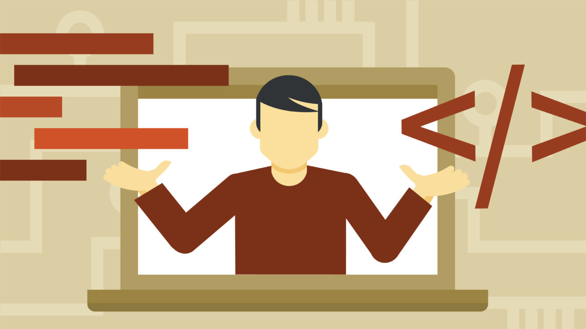
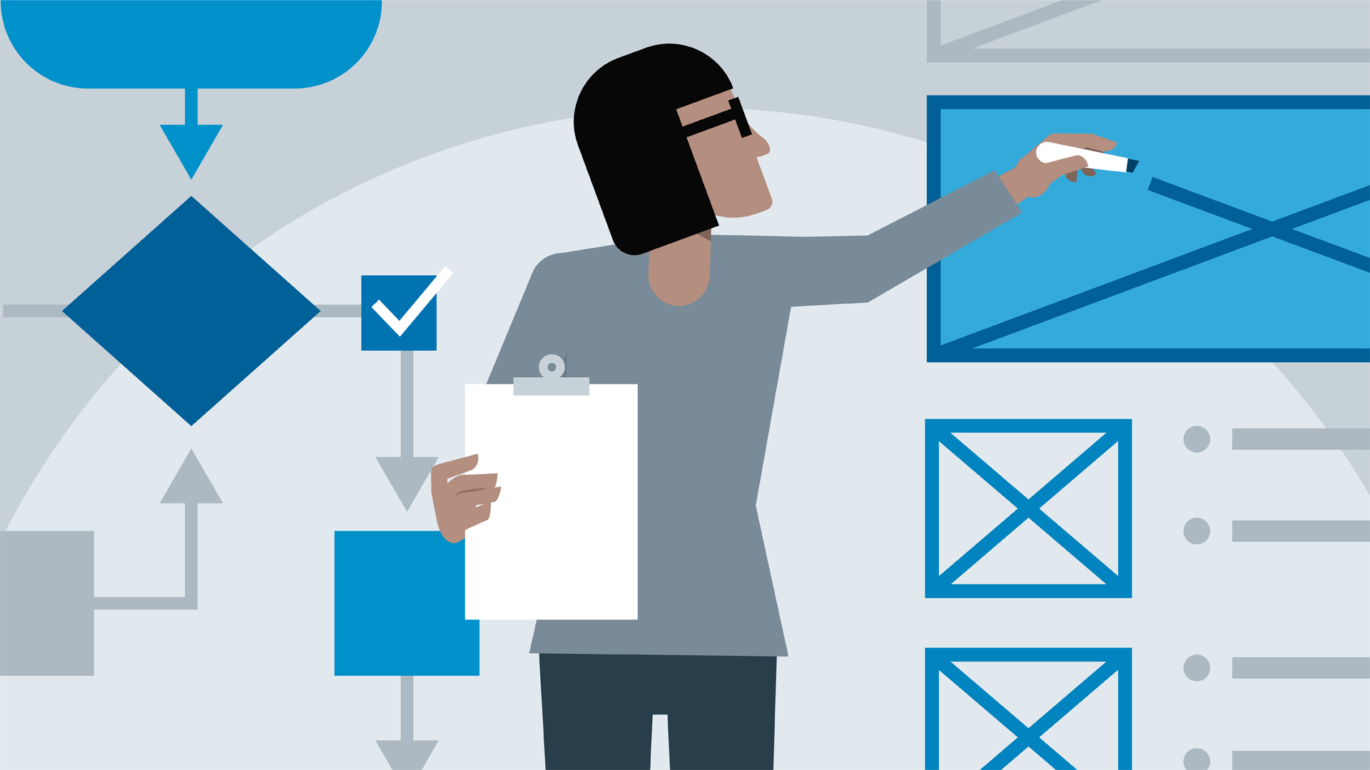
It seems odd that many Web Designers can’t code their own designs, but it appears to be the case of many designers when they are starting. Today the profession of UX/UI looks more like a re-brand of another type of vector-design, instead of an evolution website design and production. As designers mature, some of them get even more distant from real production environments. while others, make the wise decision of opening up the skillset and bridge the gap in between a drawing or a real UI prototype.  Many designers come from a strictly visual background and have phobia, disinterest or plain laziness to learn anything that is beyond drag and drop. Finally learning HTML and CSS in order to code front-end design is probably the best decision designers can make. Here are five solid reasons why I think designers should get their hands dirty with code and stop the snobbery of thinking they are the gods who create the rules and developers are their slaves who build what they say they want. Developers have their own new challenges especially in the field of Javascript.

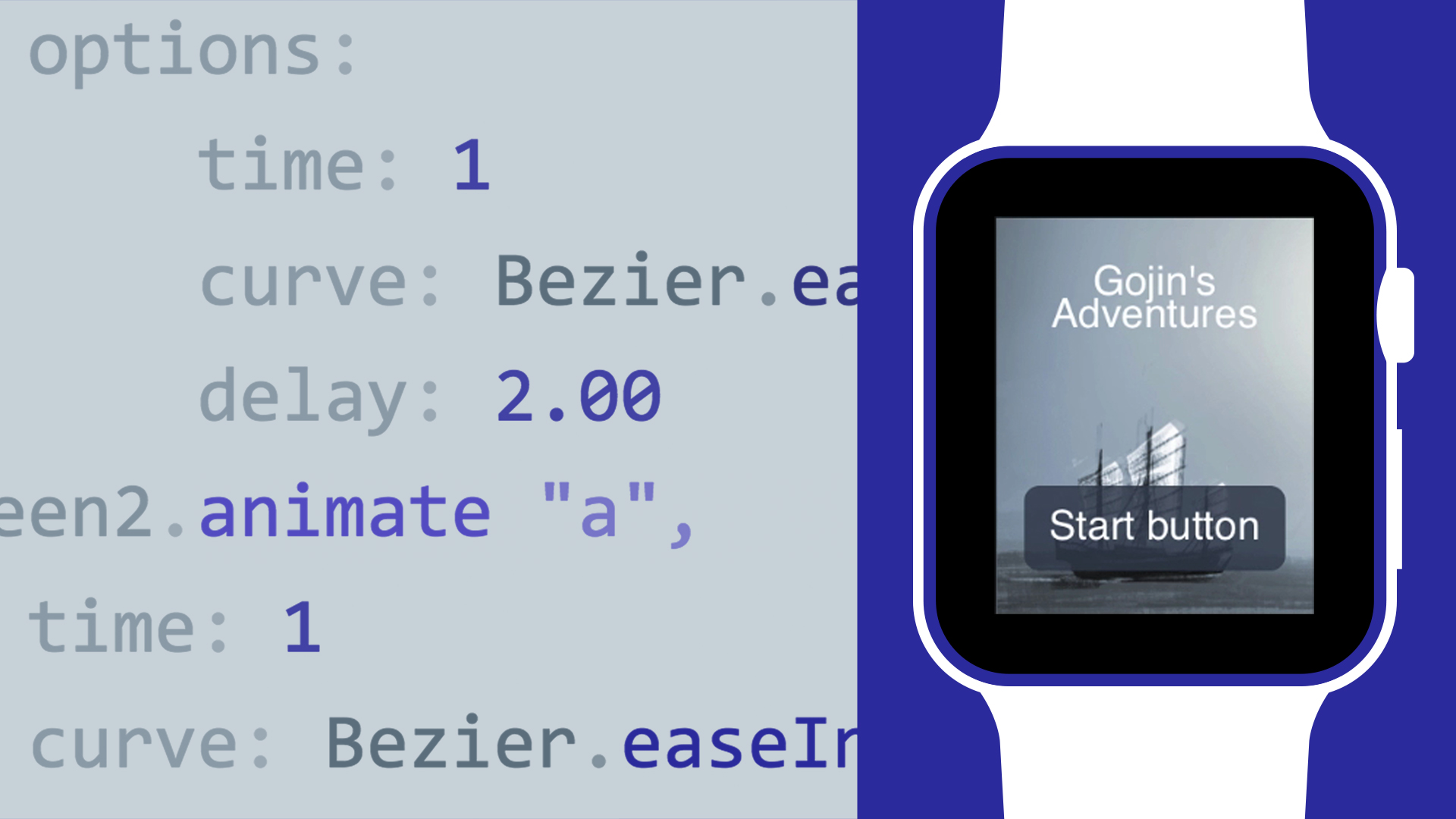
Reason 1: The combination of designing in a graphics program along with HTML & CSS (And Javascript) is said to be greater than the sum of the parts. Many people view code as a restriction to a designer but when I learn to code I found it empowering. Far from being a restriction, it opens up a whole new realm of creative options and opportunities. Now you can move from digital crayons into working with the real materials of the web. Learning code makes designers great again.

Reason 2: Your designs will be brought to life in exactly the way you want them too. Making sure the design intention is carried all the way from conception to product. If you completely separate the duties of designing and coding there inevitably comes a point in a project where the coder ends up doing design, at which point the design may degrade. This isn’t the fault of the coder. It’s just not practical to go back to the designer for a Photoshop mock-up every time a new section or component of the site needs to be designed/added.

Reason 3: It’s even arguable that HTML & CSS is more a designer’s tool than developer’s. In fact, CSS is a declarative, semantic, user-friendly language strictly focused on presentations, therefore, geared towards “website design” from its conception. So, if you’re a designer who doesn’t code, it might seem like a daunting task to learn. Learn it, you won’t regret it.

Reason 4: It’s massively time-saving to be able to both design and code. Like I said in my last point, once you reach the point in a project where you feel comfortable designing in the browser you instantly cut out all those Photoshop mock-ups you would have handed over to a coder, only to re-do in code what you’ve already done in Photoshop.

Reason 5: If you’re a designer who can’t code, learning code opens up a whole new world of job opportunities with increasing salary advantages, whether you’re looking for freelance gigs or permanent employment in a company. One of the main reasons I learn to code was because I was so frustrated by the lack of opportunities for designers who can’t code.

In Conclusion: Obviously there are times when it’s just not practical or the best use of a designer’s time to be forever updating a website, especially with larger projects but on the whole if you care about how the content on your site is presented I think you get the best results with a designer that knows how to code.


Design takes more than just code and markup, also tools that can make the difference between good work with exceptional pieces. Check out designerweapons.com for resources and tools designers love.


Design moving to the browser

Designers should move as fast as possible to the browser. What you see is what you get. No more spending time measuring every pixel before handing it over to engineers. It’s all in the code. You can easily iterate on your design without having an engineer to help you. Less questions and meetings with stakeholders, clients, engineers = Time saved = Money saved. Animation is no longer an afterthought. You actually think more about how a hover state should animate, or how you can solve the problems better with interaction. Sketch is great for getting a general concept of what you want to build together. But move to the browser as fast as you can. The benefits listed above should answer as to why.

How reverse brainstorming allows designers to find clever ideas

There are many tools and techniques to jump-start the design process such as mind maps, braindumps, group discussion, SWOT analysis, reversed brainstorming and others. Each of these mind tools has its own key points that qualify it to accomplish innovative solutions or initiative new project ideas. One of the main tools and most generally known and used is brainstorming. In simple ways, it refers to holding a meeting with stakeholders to mix up ideas and discuss the problem and the challenges that they may face solving such problem. However, creativity does not work in this way. Designers, especially, cannot just be creative based on a scheduled time or by getting the command to become creative. Best creative ideas come to us while showering, brushing our teeth, cleaning dishes or while driving our cars on the highway. Asking someone in a meeting on “how to solve a specific problem?” does not help to get creative results at all.

What is Reverse Brainstorming?
If you want to reach creative output, the process needs to be creative. However, the above-mentioned brainstorming technique lacks the creativity needed to obtain the desired results out of the session. Reverse brainstorming solves the problem in a backward way. The method can influence the mind to inseminate clever ideas and solutions.

Reverse brainstorming is a design thinking tool
Instead of asking how to solve X problem, reverse brainstorming is about finding what causes the problem or how to achieve an opposite result of what is expected. This method helps a team to understand the problem and flashes the ideas that can be used to solve it among other ideas discussed during the meeting. Reverse brainstorming provides unconventional thinking mechanisms to reach solutions that other thinking methods do not achieve. As creative thinking requires a flow of ideas, reverse brainstorming can help teams to create with unique thinking methods. Reverse brainstorming can be applied directly to the discussion meeting or it can be used if ordinary brainstorming fails to reach the desired solution for the problem or the targeted creative approach.

Powerful Mini Projector for designers: the DBPOWER T20

Have you ever wanted or fantasized about having a full-blown screen on your wall, I love designing with the largest possible screen, that way I can see all the way to the pixel, I can experience this cinema-mode design which makes me feel immersed on whatever I’m doing, it can be a web page, a video, a composition in Photoshop, or just plain code. There are many projectors out there but one that got me because of price/vs lumens vs quality is the DBPOWER T70 . This is the projector we use for our presentations, entertainment, and design.null
Get it from Amazon

What are the best keyboards for designers? here our pick.

I still own a mechanical keyboard from the 90’s in perfect condition, it was the keyboard of my first Amiga computer. Guess what, mechanical keyboards are coming back, or actually, they never went away… There is something about being able to type “hard” that you can’t experience in the newer ultra soft keystrokes of laptops. This keyboard is pretty fun to use when creating your designs. I can’t tell you too much about Chinese companies who are selling good old school mechanical keyboards, but Hcman one is fantastic, and it’s one of the cheapest. For the same price of that Logitech rubber dome keyboard you see at Walmart or Best Buy, can get a mechanical keyboard! The switches are very clicky, very loud compared to a normal membrane keyboard, so don’t get it if you’re planning on using it in an office with other people unless you want to be that guy. For me, it works since it’s just sitting in front of my gaming PC at home, and on a subconscious level the sound reminds me, “I own a mechanical keyboard now!”.

null

The instructions aren’t terribly clear for the lighting modes, but they’re fairly easy to figure out (FN+1 or 2 or 3 or 4…etc, and they can be reprogrammed with FN+Esc). The lighting colors can’t be changed, each row has its own color, but for $25 it’s not a problem. The only thing I really wish this had that it doesn’t is a USB hub in it like my previous keyboard, but again, most plain keyboards you can buy at Walmart for the same price don’t have that, and I can live without it.

Get your designer keyboard from Amazon

The Dumbing Down of UX Designers

by: David Echeverri

With an emerging economy of one-day online courses, one-week science curriculums, 3-hour full-development courses, and quick-fixes, the design industry is on the verge of suffering a dramatic dumb down. In this fully opinionated post, I’ll break down exactly why I think this phenomenon is occurring, what causes it and how it ends up being extremely costly for the internet industry as a whole, especially for those wanting to hire competent designers and create amazing products. In the past, and still today, many designers will stand out by mastering multiple crafts and disciplines such as graphic design, web development, animation, video production, marketing along with some other skills. Now, if you can do some doodling, hand sketching, and you dominate a full pack of Crayolas, you can actually call yourself a UX Designer. You can use new catchy UX buzzwords and apply for industry jobs. But the scary part… These masters of crayons end up being hired and getting entitled to take critical decisions compromising technical feasibility and time-to-market of products. Since Steve Jobs gave UX design a front-sit role in product development, many other tech companies tried to follow the trend. The difference is, designers at Apple are not just doodlers, they design products with high technological sophistication.

Typical Example:
A SaaS company has a product initiative, they pass it to the UX designer, the designer takes his new weapon of choice: paper, pen, and crayolas, forget about the computer, forget about design software and don’t even think about code… no, designers these days want to earn 120k/year by making couple of sketches per month, and when their stress levels go up, they will probably start outsourcing their designs not to India or China, but to the nearest elementary school’s art class.

What causes the dumb down:

Codephobia: Many Designers refuse to learn code and will commit suicide if they are asked to do so. What about reading data or using numbers? what the hell is that? no way Jose, “I’m a designer, not a numbers guy”. Codephobia is likely the number one impediment for designers to get a better understanding of what’s behind the “hood” of the designs they want to see implemented.

Art History Ignorance: New designers are completely ignorant about where design roots comes from. They will claim “flat design” or “grid design” is the latest trend, not knowing how these trends come from 70 years ago when your great-grandfather was dating your great-grandmother.

Ultra Specialization Complex: Designers think their role is now so specialized, that they can get away designing buttons in sketch or inVision for the next 3 years, staying busy and compartmentalized while earning 100k

Peer Comforting: Designers are being told by their own peers not to try to learn code, or business, or marketing because that is not “design”. Some progressive design groups encourage disconnection of mechanics because if they get too technical.. they stop being designers and will end up less creative. Peer comforters will claim that creativity comes form ingenuity and from not knowing technical restrictions. They wrongly equate technical proficiency with lack of creativity.

Creative Product Entitlement: Since UX designers are the new cool kids on the web, they can make the argument of “design and medium are different” and based on this logic, a design made in a toilet paper square or a sketch on a napkin can contain the pure concept. In fact, the more abstract the concept, the more sketchy, the more device agnostic it is… therefore, the designer will be praised and rewarded for this progressive approach.

Gimmicky Software: Designers think that learning the latest sketching tool will get them to the top of the design chain, they will claim to use 20 programs. What they don’t tell you is that all those new programs are all improved versions of Microsoft paint brush with zero production-ready output.

Kindergarden Nostalgia: Even senior Designers are known for showing up their collection of action hero toys on their desks, they want to claim back their childhood because this was the time they were free to explore the properties of plastelin and water-brushes. Nostalgic designers will do anything possible to convey their ideas in the paper, in napkins, in any low fidelity medium, because the less fidelity, the more “pure” or “conceptual” de idea is.

The new UX Design Deliverables in the dumbed-down design industry:

*Shaky, cartoony, low definition sketch made with a cheap pen
Call it: “User Journeys” “User Experience Journeys”

Storyboard
Figure:
Sketchy storyboards, made by newbie designers, costing the product team about 5k can be made by 10 year old kids of 5th grade in a lunch break.


*1-minute, pre-teen doodles with some numbers and arrows on it
Call it: “User Feature Map” “UX Feature Set”

1-AuQWB1Dpg1zfUU-GRUk80g
Figure: Sketchy doodley “User Experiences” are now common accepted deliverables. They are made in pen and paper by designers claiming their genius mind is so advanced they don’t even need to put a proper digital document together. They can still make a case about how this doodle will define the future of the amazing tool the dev team will build.


*Post-It notes with squares and circles on it
Call it: “UX Product Plan” or “Page Flows”

facilitating-ideas--storyboard

Figure: Oh wait, did I forget to mention the new tool in the arsenal of the modern UX Designer? or “UExxer”? that’s right, the Post-it note. Forget about functional mobile prototypes, desktop mocks, and all that techie stuff. If you dominate modern UX, you gotta own it, so, paper is not even needed, grab a bunch of post notes, write whatever the hell you want on them, make it as “abstract” as you can, and then claim you have the world’s brightest software product idea.


What designers can do about it: 

Unless newcomer designers, especially millennial, claim back their hard skills, design departments will get closer and closer to a child care dept. Will you let your kindergarten take control of your product development? No, you won’t, instead, you should demand for competent, well-rounded professionals who can take care of your project, with an understanding of the creative, technical and marketing component of the business and industry. Contact Models of Identity and have your project handled with the proper care and knowledge.


How the UX Card Sorting Technique Accelerates Web Projects

Card sorting is a well-established design-research technique extremely handy for discovering how people break down and categorize information. You can use card sorting results to group and create your web project in a way that makes the most sense to your audience.

Card sorting is useful when you want to:

  • Design a new website or section of a website
  • Find out how your customers expect to see your information grouped
  • Understand and compare how people conceptualize different concepts or items
  • Get people to rank or arrange items based on set criteria.

Card sorting involves creating a set of cards that each represent a web feature or section, and asking people to group the cards in a way that makes sense to them. You can run an open, a closed, or a hybrid card sort, depending on what you want to find out.

Open card sort: Participants sort cards into categories that make sense to them, and label each category themselves

Closed card sort: Participants sort cards into categories you give them

Hybrid card sort: Participants sort cards into categories you give them, and can create their own categories as well

The three card sorting techniques you can choose from — open, closed, and hybrid — will each tell you something different about how people understand and group your information. Choosing the right technique at the right time is key to gathering high-quality, relevant data to inform your design decisions. Since one of the goals of card sorting is to get inside the minds of the people you design for, take time to establish, recruit, and manage participants that will give you the most true-to-life data. For card sorting participants, we recommend you to download DECK UX kit:

DECK UX is a one on a kind solution for ARCHITECTING WEBSITES and PRESENTING your web projects from the user experience perspective. with DECK UX you can:

  • Create beautiful Site Maps
  • Design Multi-purpose Web Architecture
  • Stylize your UX Presentations


Creating and running a card sort is the best way to learn the technique and start using the data to improve your designs.

How to Design Web Interfaces to Visualize Business Solutions

Modeling is about creating a representational artifact of the real thing. For example, in the car manufacturing industry “models” are static versions of concept vehicles. These models are responsible of presenting a concept in greater detail. 3d models allow architects, engineers and product designers visualize inventions and goods. Interface Models allow for user feedback and are cheaper) to produce compared to the actual end product (the car). The process of modeling begins with a concept and results into a series of visible mockups or interactive pages that represent the solution to the problem you are targeting.
To understand models in the context you are going to keep these things in mind:

Modeling is not prototyping.
Modeling is a representation of the real thing.
A Model is a referential point to guide implementation.
A Model should be self explanatory.

box

TIP: Once you have a design concept in mind to communicate and propose, create a model to validate your idea, collect feedback and move into production.


UX Projects: Presenting Recommendations

As designers, we’re creative and passionate people who give our souls into design projects. But we can lose this passion when we present new concepts to clients or teammates. Presenting design work incorrectly can misdirected or lead to overly prescriptive feedback, which in turn leads to sub-par end work. Skillful presenting skills allow us to put designs out into the world that we’re proud to put our names on. Here are some thoughts for your next design pitch or presentation.

Polish your presentation: Present your work in the best possible format. If it’s a static image of a web design, mock it up in an image of an actual computer monitor. If you’re sharing your screen, close unneeded tabs and windows and present in full-screen mode. Download a starter kits of pre-packed mockups for presenting designs.

Use an effective presentation template: Don’t put too much text in your presentation, and when you do, keep it big and bold for readability. Have one main point per slide, even if it makes your deck longer. Too much content per slide will end up overwhelming your audience. Rehearse your presentation few times to become familiar with your points. present each slide—it’ll help you move seamlessly from slide to slide when you present. The rule here is: One Point per Slide.

Set the Overall Project Context: If you don’t know what the hell is going on, probably your audience won’t help you. Nothing is worse than an out-of-context out-of-focus design presentation. Set the appropriate context at the beginning of the meeting and save agony down the road. At the beginning of each project meeting, reiterate the business goals, recall their feedback from last session, and set the main 3 to 5 objectives for the meeting. This reminds them why they’re in the room and what kind of input is needed, while keeping the discussion on target. Using a template that includes an outline slide lets everyone interested know what will be covered and in what is the order. This provides your attendees with structure and ensures you don’t forget to review items during the meeting.

Tell the story: Tell the story about how your design came to existence, walk through each part of the design and explain the rationale behind your decisions. Talk about the design’s benefits, and how it solves the project goals. Avoid talking about what is already obvious or what’s already clear in plain view.

Name your Concepts: When presenting multiple options, give a name to each concept and show a recap with those options on one page. This makes it easier for discussion at the end of the review.

Present your most straightforward design first: Do not play a mystery game with your audience, dive into the main point first, This gives reviewers confidence that you have a grasp to the project and understand its objectives. Once this trust is established, they’ll be more receptive to ideas you present later that may be more conceptual.

Control the speed: Talking faster doesn’t make you look smarter, Take your time to showcase your design in greater detail, be mindful and read the room if you see someone getting distracted checking on their facebook or instagram, it’s time to speed things up (or perhaps to add enthusiasm to your voice). Keep an eye on the time—if the discussion gets off track or the meeting is scheduled to end soon, look for an opportunity to respectfully remind attendees of the goals for the meeting, offer to schedule an upcoming follow-up meeting to discuss the remaining topics as needed.

Get the right input: Explain to the client the kind of input you are looking to get. For example, if you’re showing page flows and wireframes, the client may not understand why you aren’t looking for feedback on graphic design details at this stage, so clarify that for them up front.

Push back on client feedback you disagree with: You’ve been hired to design, and because you’re an expert at your field, so it’s your job to give documented recommendations for a proposed solution. The client may disagree with your suggestions, but you should never get defensive or feel like your feelings are getting hurt. Designers are known for being “sensitive”, however in he professional Arena, your job is not to cry or feel hated. Simply listen to the client and be thoughtful of their point of view. They can bring valuable insights and ideas that can make the final design stronger.

Dealing with Harsh Clients: If the client chooses to continually ignore your advice, it’s a business gamble on their part. To protect your sanity, your best option might be to do all you can within their constraints, leave the project out of your portfolio, and move on.

Be confident: The absolute most important thing when presenting design work: show enthusiasm and confidence. Confidence doesn’t come to you because of a personality trait. confidence people speak confident because they know what they are talking about and are excited to share it with other people. If you’re confident in your work, your client will be too

Tips for Building an Effective Design Process

A solid design process is the cornerstone of creating a great user experience. Each organization resists to change legacy systems, therefore adapting a process to the specific constraints you face is a huge challenge, especially in an organization that might still be a little uncomfortable with design.

1. Understand the Context

Every good design is based on a solid understanding of the problem it solves. Doing the research to understand the problem and context will equip you to make more informed decisions, and doesn’t need to take a huge investment of time or money.

You can learn a lot from just a day or two of talking to users and stakeholders. The three categories we usually focus on during our qualitative research are the user’s needs, the business’ needs, and the product/service domain. No matter what project you work on, or what process you use, taking the time to do even a little research can pay off huge dividends.


Research:

Understand the tradeoffs: You may not be able to get to everything; focus your research on the most critical assumptions you need to verify.

Acknowledge assumptions: Be explicit about what you don’t know and what assumptions your design relies upon.

Make your findings clear: Synthesize your research and make it easy to digest for the rest of the team. This could be in the form of personas and scenarios, affinity diagrams, or just bulleted insights; Whatever will help your team understand and use the findings later on.

2. Explore and Evaluate

Once you understand the context surrounding your problem, you’ll need to come up with creative, yet practical ideas to design a solution. Exploration and evaluation are complementary modes of thinking that together provide a simple way to maximize the creative potential of your team without going off into a whimsical idea-land where nothing is feasible.

The crux of exploration is that in order to have good ideas, you need to have a lot of ideas. At Cooper, we’ll often do timed ideation sessions where each team member is responsible for coming up with eight totally different ideas in just five minutes. The crazy time limit ensures we aren’t thinking too deeply about each idea, but instead generating a huge breadth of different directions and ideas to explore.

Next, evaluation brings us back to reality by thinking through each idea. It’s at this point where we take a critical (yet constructive) eye to each idea and see how it holds up. As much as possible, we base our evaluation off of our research insights, driving us toward a creative solution that is grounded in the facts from our research.
The combined effect of exploration and evaluation is a powerful way to consistently make h3 creative decisions. You can integrate it into whatever process you use, and tailor the breadth of your exploration to whatever time constraints you face.

3. Iterate Rapidly

No matter how great your team is, your product isn’t going to be perfect the first time. Or the second time. The quickest way to improve your design is to show it to people, get feedback, and iterate.

This idea applies on multiple scales. At the production level, rapid releases are the base of Agile development. They allow you to adapt quickly to a changing landscape, and rapidly address feedback from users. Before production begins, rapidly iterating in the cheapest possible prototyping medium with save you huge amounts of time and money. At a first pass, just show a hand sketch to your peers, get feedback, and iterate on it. Only move into a higher fidelity when you have a good reason to.

Like the other principles, rapid iteration is an idea that can be used within any process. While iterating quickly on a larger scale may require more significant changes, you can easily integrate it into your everyday practice. Show your work early and often, before you invest significant time in it.

The Next Steps

These three simple practices bundle up the most important aspects of design into a form that can be applied almost anywhere. Are there other big ideas behind design that you use? Have you had success with these in the past?